There has been an idea lingering in the back of my mind, slowly growing with each passing day. A disturbing sensation entrenching itself page after page. The internet feels empty …
I know this feeling isn’t just my own, talk of the “dead internet” indicates as much. Yet, it feels like the talk of bots taking over is actually distracting us from another culprit, very much human this time.
The idea emerged to the front of my mind when I stumbled onto this discussion where someone was talking about how they had just rebuilt their old website from 15 years ago with a sleek new design, incorporating all the best practices.
And it was through this side by side comparison that I finally understood something … this was done by design.
What changed? The frontend simplified radically. The best websites of 2026 look like printed magazines, not sci-fi dashboards. Decoration left. Typography and space took center stage. We stopped showing off our tools and started getting out of the content’s way.
Claude Shannon, the father of the deliberately awfully named “information theory” defined information as “surprise”, in the sense that the less probable an event is, the more surprising it is and the more information it yields. These events are the heavy tails of distribution, your outlier events.
Ironically, in an attempt to get out of the way of the content, they removed the information.
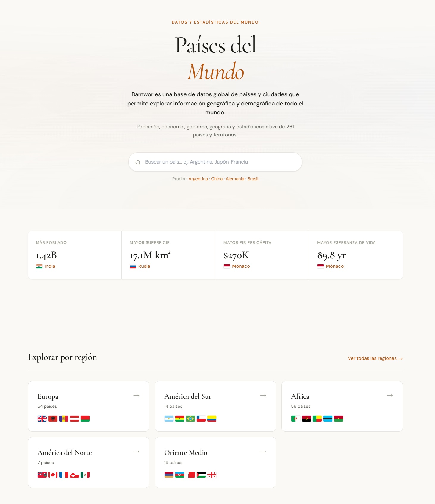
This revived website is a fact book, it compiles geographic information like demographics, airports and city data. It’s a place you can go if you want to know the beer consumption per capita in Algeria, and it is deliberately designed to that effect: as a tool.
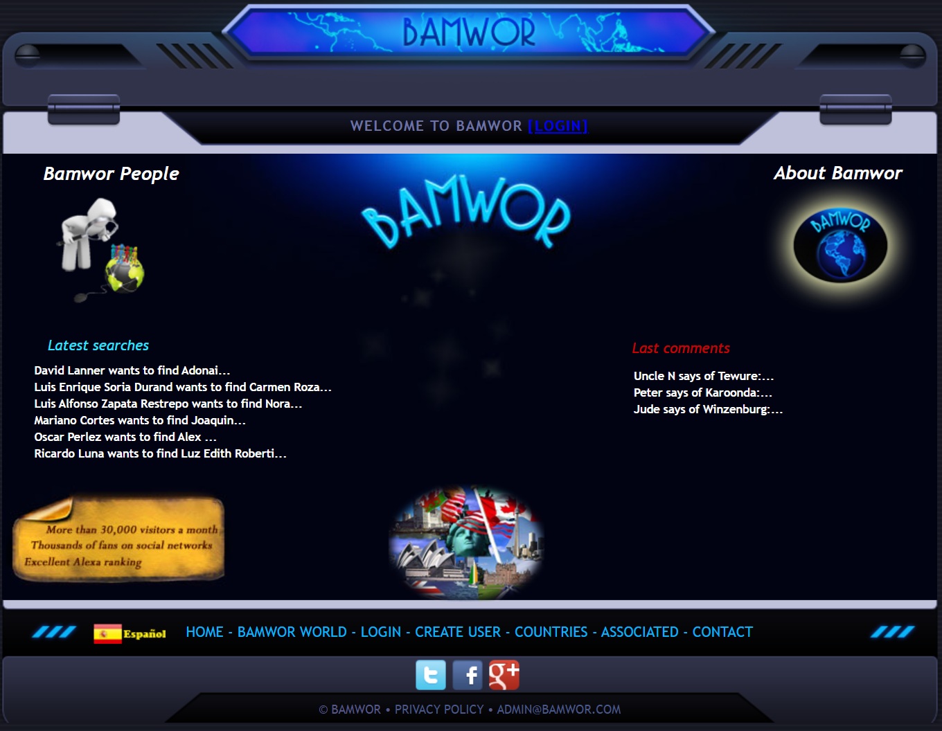
The old 2011 version was different, it feels like a distinct place, behind its role as a factbook, it’s a virtual space you would spend time exploring. But its 2026 counterpart deliberately shed that skin, it’s goal is purely utilitarian. And behind the talk of SEO optimization, MCP servers, and structured geographic data APIs, lies a disturbing reality: humans exploring the web are not the target audience.
That the market for structured geographic data APIs is still surprisingly underserved. RestCountries exists but only covers basics. GeoNames has raw data but a dated API. There’s a real gap for a modern, developer-friendly service that combines both.
Descent into blandness#
Do you also get the sense that everything feels the same? How most personal blogs feel like the same uninspired copy/paste loop of repetitive themes?
And then there is the content, the 2 to 6 minute long posts that barely scratch the surface of a topic, written as if the author was afraid any more would aggress the poor reader’s attention span. With all the angles massaged into an inoffensive blob. The impersonal language of “we”, making you wonder if even small bulletins are written by committee now.
Content produced in an attempt to please everyone but actually talks to no one.
Personal websites#
We didn’t want to get in the way of the message!
We wanted this to be accessible!
We wanted this to be SEO optimized!
We wanted this to be inoffensive!
And surprise surprise, you have killed surprises, you have killed personality, we have killed exploration. These were never the goals.
This was a premeditated murder.
There is another corner of the internet, a small retreat intentionally built brimming with personality. It’s opinionated, doesn’t neatly scale to your window sizes, it hurts your eyes, and guess what: that is by design!
Aesthetic norms are binding, norms are binding. They don’t just constrain what people make, they constrain what people think about making.
And so on some small ignored corner of the internet people are deliberately rejecting all the convention that have sucked the life out of our modern web and creating their own small internet. These sites are designed by and for their creators, they are not meant to be monetized, most of them are never even meant to be linked back to their original authors. They are pure expressions of their creators’ whims, subservient to no design convention. Between the gauhtly fuchsia pinks and animated favicon cats many would qualify as ugly.
And so be it.
The freedom that comes with being ugly is part of the message.
Down the rainbow comic sans rabbit hole#
Oh wait ? Did you think this post was going to stop here ?
How ironic would it be if after all my ranting I was to stop here, with a perfectly curated 5 minute readtime and the bare minimum context for setting the stage.
Let’s go for a ride, and if I do my job right, you will get lost on the way.

The politically incorrect#
Exhibit A: https://ludic.mataroa.blog/
Their are the friends you invite to public events and then there is Ludic Mataroa, the friend you invite to sit down and chat over drinks at your place on Friday nights.
Like a dirty little secret of the tech world people indulge in these long viciously funny rants, but never will they openly admit it figures on there list of top blogs in place of Paul Graham’s blog whoes essays they have actually never read.
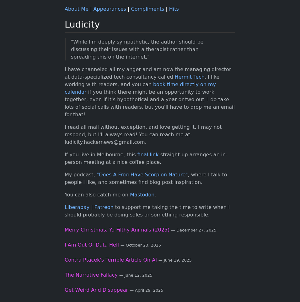
On the surface this looks like a perfectly standard tech blog with it’s black/blueish
background and its DejaVu Sans font (Yes, this is seriously the fonts name, you can’t make this up).
But that only adds to the pleasure knowing you could secretly be reading this
fountain of pure contempt for the “tech industry” and people passing behind your desk would
be none the wiser.
Gold in plain sight#
Exbibit B: https://dbushell.com/
And sometimes, you will stumble on gold, in the midst of the mainstream a small handcrafted thing of beauty, launched into the world by someone with enough skill and confidence to break free from the mold.
The authors behind these blogs knowingly turn there backs on part of their potential audience, and in doing so, create an actual following.
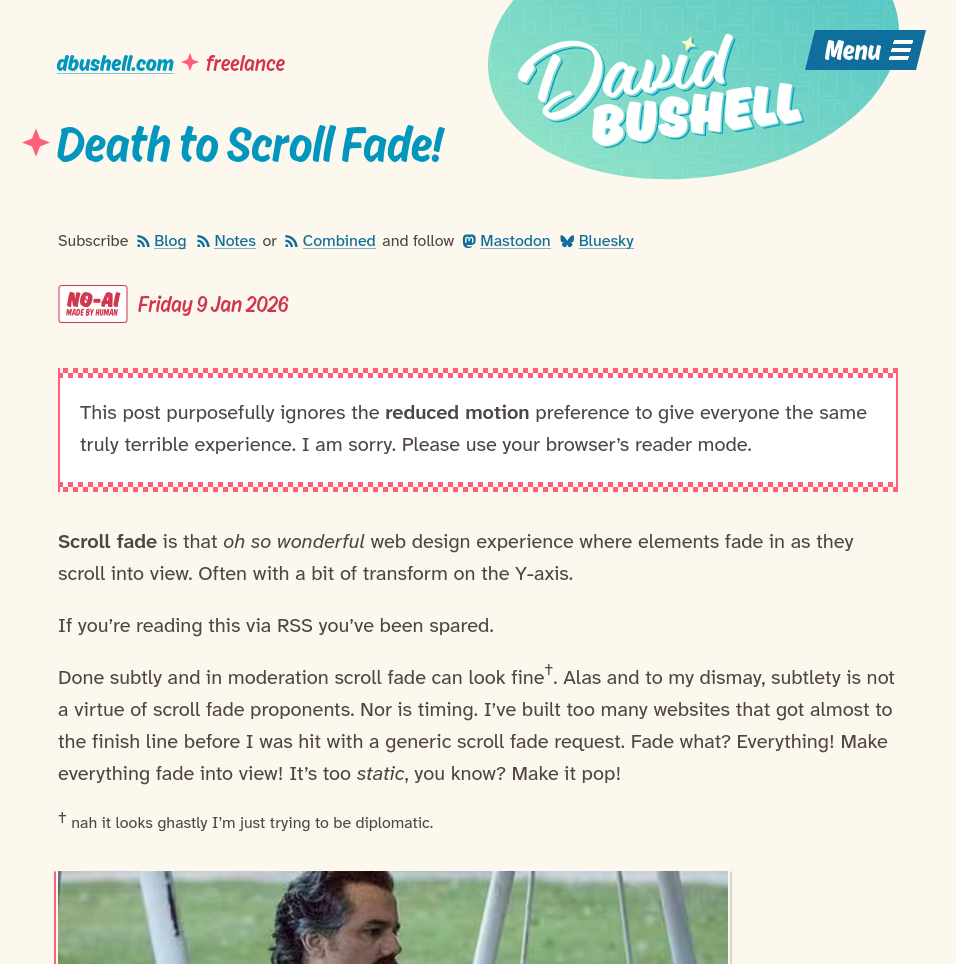
Sometimes this comes with business implications like the case of David Bushell, who’s unabashedly anti AI stance is bound to have lost him more than a few leads for his freelance web development business.
But, the craft comes first and it shows.
These are beautifully kept walled gardens, where each small blog post might open the door to a series of new ideas and small details are meticulously crafted.
This sites invite exploration, regardless of what you initially came for, there is something to find.
Hidden gems#
Exhibit C: https://blamensir.neocities.org/
Let us diverge off into the wilderness where the rules of what qualify as “good web design” have already started breaking down.
These are closer to internet hosted art installations than websites, and the interactive nature is part of the exhibit.

Are websites supposed to be medieval inspired assemblies of scanned paper cutouts ? No ? Well that doesn’t matter, because it looks beautiful.
Wait, sorry, I lost myself there, gosh, there is more I need to show you.
What am I looking at?#
Exhibit D :

In a world of curated public personas there is something deeply comforting in finding someones authentically personal blog.
Forget conventions: if people want it they will build it. It will be unique and it will be great!
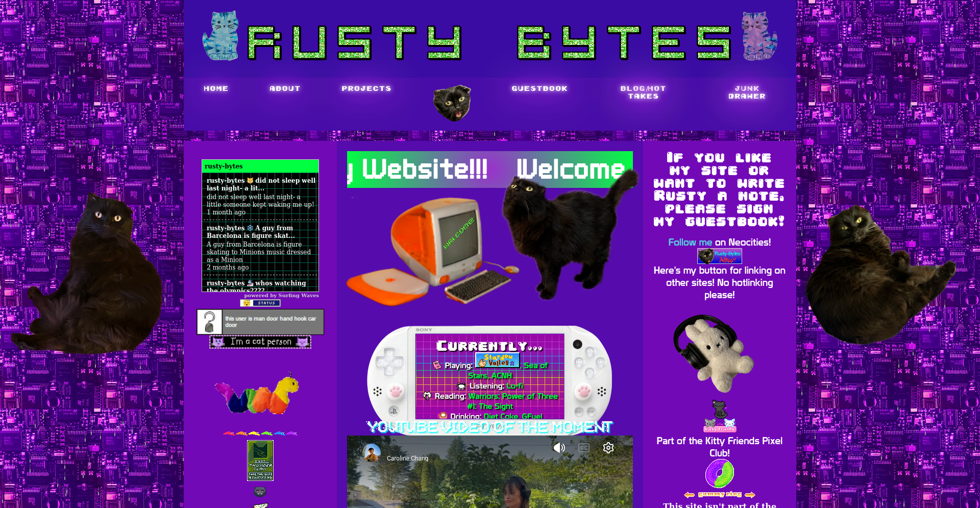
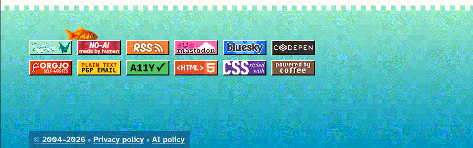
Cursors shapped like diet coke cans and cat instagrams ? Check.
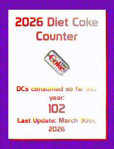
But behind the questionable aesthetic choices there is the deliberate act to truly build for oneself. You and I dear reader are only accidentally the target audience, these websites are build for there creators and there friends.
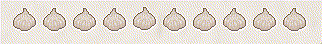
I love garlic#
Exhibit E: https://joro.nu/garlic/
Who doesn’t want a website dedicated to garlic ?
Have you been desperately looking for a personality quiz to help you decide what garlic subtype of Allium sativum matches you best, so you can start anthropomorphizing your pasta sauce ? So has the creator of this site!
Cherry on top: once you have finished taking the survey, you to, can proudly host your personality test results on your very own blog!
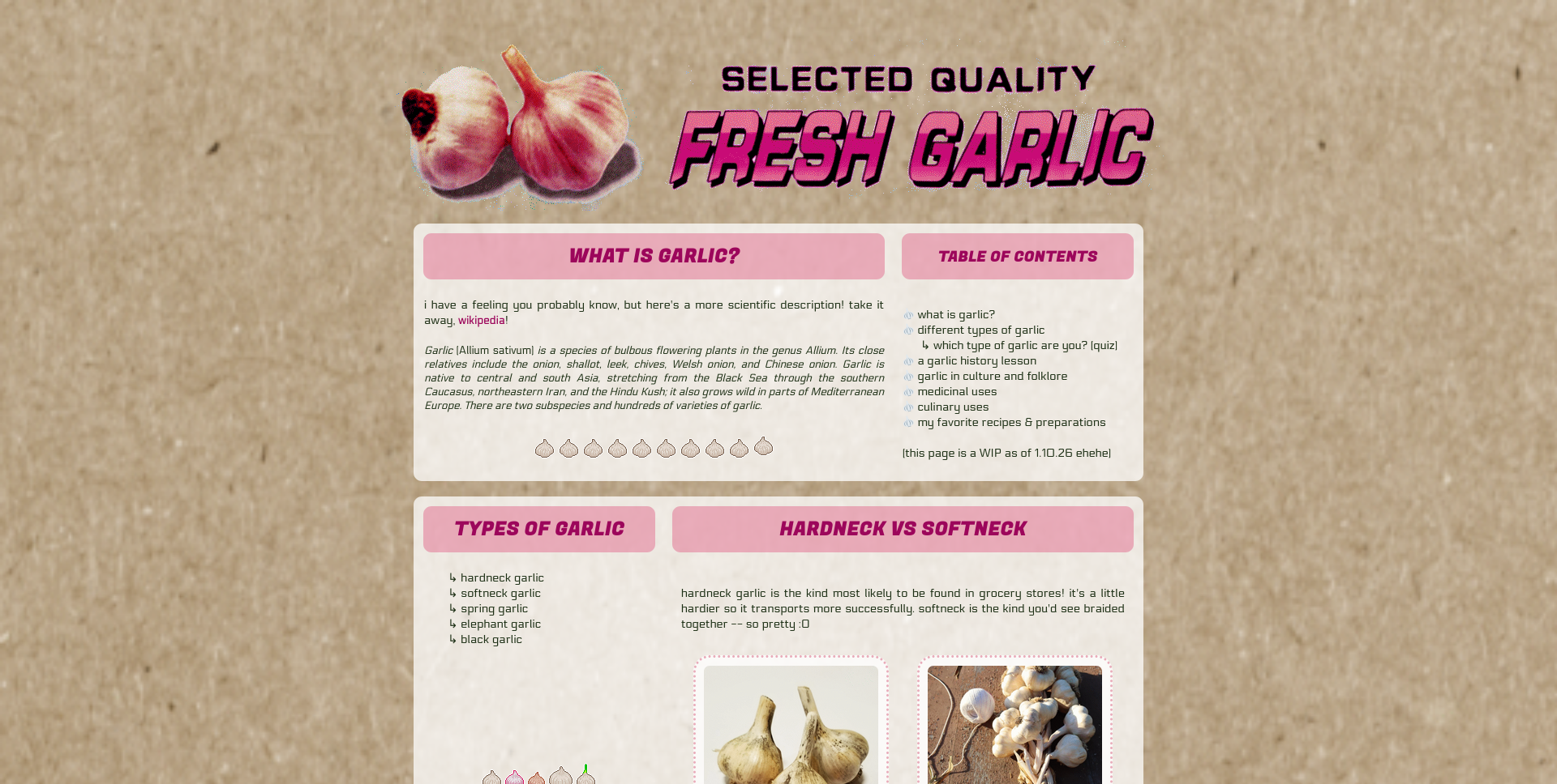
Just look at how cute these little garlic gifs are ? How can anyone resist ?
This website gets extra points for also throwing typography out the window and firmly commiting
to using only lowercase.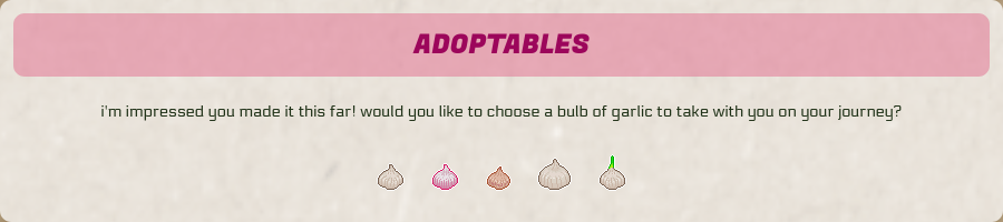
Why ?#
Exhibit F: https://fish2fish.neocities.org/mainpage/main
I have so many questions … where do I even start?
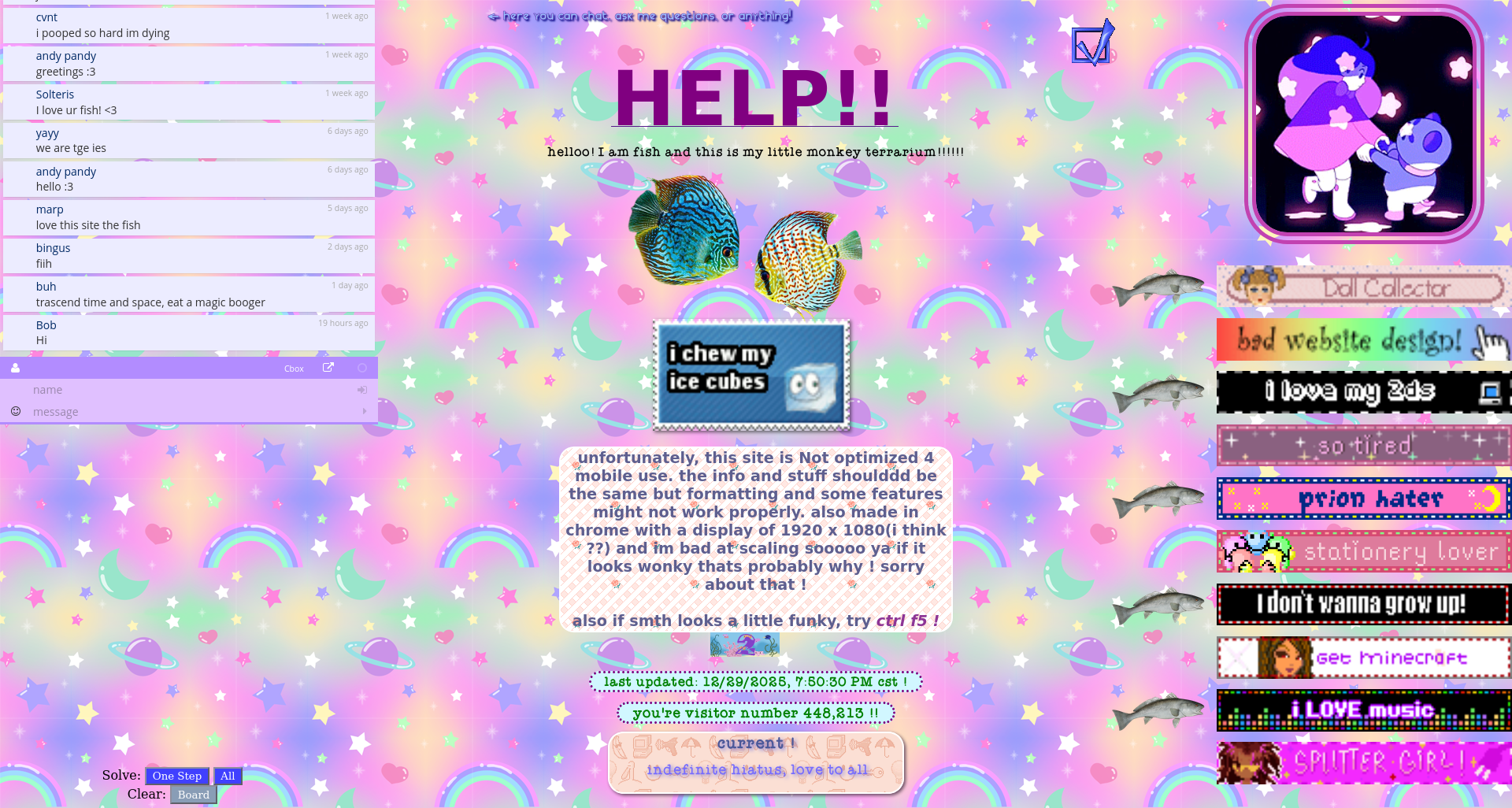
Don’t ask me, at this level in the iceberg I have no idea what I am looking at ether.
helloo! I am fish and this is my little monkey terrarium!!!!!!
But between the broken javascript and the confession of chewing ice cubes I am fascinated.
And even now, I am still just scratching the surface.